
Climate Visualized by Atlas Guo
MEDIUM: Map, Data Visualization, Website
DESCRIPTION:
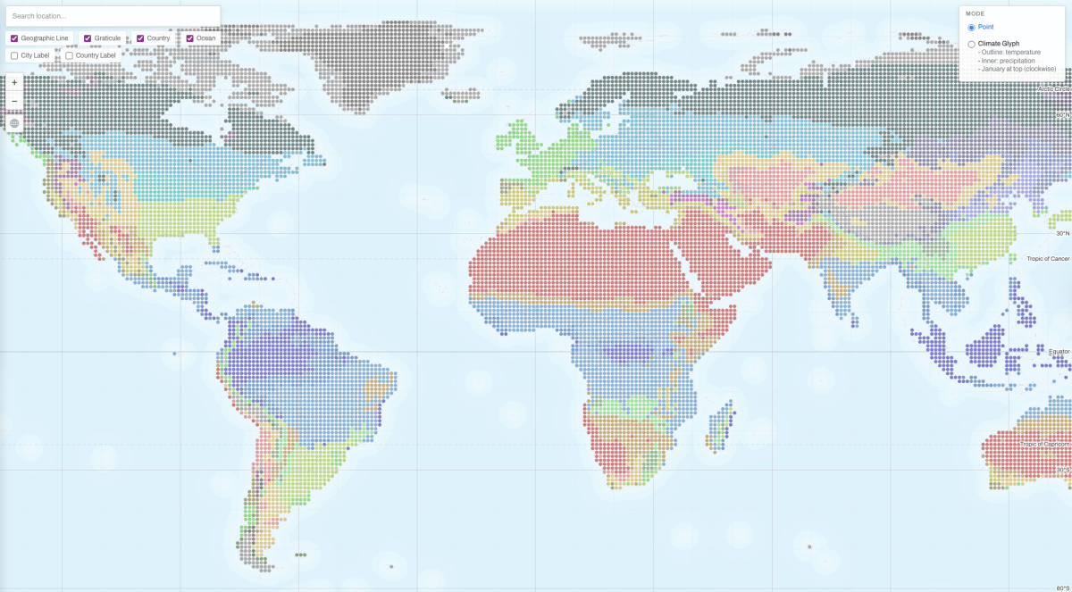
Climate Visualized is an interactive web map of global climates based on the Köppen-Geiger climate classification. It visualizes 29 climate types on a one-degree by one-degree global grid for the 1990 to 2020 period. In its default mode, the map shows colored points for different climate types. In advanced mode, each valid grid cell is represented by a statistical glyph of monthly temperature and precipitation arranged clockwise from January at the top. Built with D3.js, it allows users to hover over valid locations to view climate types, letter meanings, and local charts in real time, and it supports responsive layouts for both desktop and mobile displays.
ARTIST’S STATEMENT:
Climate Visualized grew out of my long-standing interest in climate and from my effort to engage more deeply with the Köppen-Geiger climate classification system. Although this schema is far from perfect, I see it as one of the most effective starting points for broader audiences to explore global climate patterns. My goal was to make this system more intuitive, visually approachable, and explorable for students, researchers, and general viewers interested in climate and geography. This project won the David Woodward Digital Map Award in the 53rd Annual CaGIS Map Design Competition and was also the Runner-Up in the Interactive Map category of the Wisconsin Land Information Association 2026 Map Contest.
View this Interactive Map