
CRAP Principles
These principles come from The Non-Designer’s Design Book by Robin Williams. The order in which we teach them was chosen by DesignLab staff. Below are the questions/considerations for each of these three overarching principles.
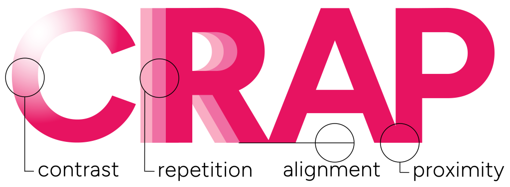
Contrast
Can be achieved through variations in size, color, line thickness, and spacing.
Try to avoid weakly similar elements by making them strongly different for hierarchy.
Use contrasting foreground and background colors for legibility.
Repetition
Repeat visual elements such as color, shapes, textures, borders, and fonts to unify your design.
Avoid excessive differentiation in your design that could confuse your audience.
Consistency is key!
Alignment
Place every element in your design with intention to create visual connections.
If everything else is aligned, whatever is misaligned will stand out.
Consider eye-tracking to make sure your project has a logical flow.
Proximity
Placing elements close together creates a relationship between the elements. Adding space separates that relationship.
Make sure headings and labels are in close proximity to their relative content.
Use “negative space” to avoid cramming too much into your project.